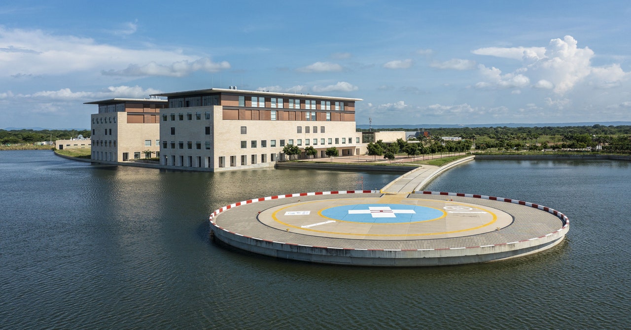
Just as medical care has evolved from bloodletting to germ theory, the medical spaces patients inhabit have transformed too. Today, architects and designers are trying to find ways to make hospitals more comfortable, in the hopes that relaxing spaces will lead to better recovery. But building for healing involves just as much empathy as it does synthesizing cold, hard data.
“Part of the best care might be keeping people calm, giving them space to be alone—things that might seem frivolous but are really important,” says Annmarie Adams, a professor at McGill University who studies the history of hospital architecture.
In the 19th century, famed nurse Florence Nightingale popularized the pavilion plan, which featured wards: big rooms with long rows of beds, large windows, lots of natural light, and plenty of cross-ventilation. These designs were informed by the theory that dank indoor spaces spread disease. But wards offered almost no privacy for patients and required plenty of space, something that became difficult to find in increasingly dense cities. They also meant a lot of walking for nurses, who had to trudge up and down the aisles.
Over the next century, that focus on natural light faded in favor of prioritizing sterile spaces that would limit the spread of germs and accommodate a growing raft of medical equipment. After World War I, the new norm was to cluster patients’ rooms around a nurses’ station. These designs were easier on nurses, who no longer had to trek long corridors, and they were cheaper to heat and build. But they retained some of the trappings of older-style residential treatment facilities, like sanatoria where patients would convalesce for long periods of time; both mimicked fancy hotels with ornate lobbies and fine food, measures intended to convince middle-class people that “they were better off in hospitals than at home when seriously ill,” Adams wrote in a 2016 article on hospital architecture for the Canadian Medical Association Journal. This design, she argued, was meant to give people faith in the institution: “a tool of persuasion, rather than healing.”
In the late 1940s and 1950s, hospitals transformed again, this time becoming office-like buildings without frills or many features meant to improve the experience of being there. “It was really designed to be operational and efficient,” says Jessie Reich, director of patient experience and magnet programs for the Hospital of the University of Pennsylvania. Many of these rooms had no windows at all, she points out.
By the middle of the 20th century, the hospital had become sort of the opposite of what Florence Nightingale had envisioned, and many of those buildings, or ones modeled after them, are still in use today. “The typical hospital is designed as a machine for delivering care, but not as a place for healing,” says Sean Scensor, a principal at Safdie Architects, a firm that recently designed a hospital in Cartagena, Colombia. “I think what’s missing is the empathy for people as human beings.”
Although Nightingale had been operating largely on anecdotal evidence that light and ventilation were important, she had been right—but it took over a century for scientists to gather the quantitative data to back her up. For example, a pivotal 1984 study published in Science followed patients after gallbladder surgery. The 25 patients whose rooms had views of greenery had shorter hospital stays and took fewer painkillers than the 23 patients whose windows faced a brick wall.


