reader comments
130 with 105 posters participating
-
Rumor has it Calibri is already working on its goodbye note.Nathan Mattise
-
Calibri made its big debut as the Microsoft standard with Windows VistaAndrew Cunningham
-
…and it held onto its position during Microsoft’s most notable moment of aesthetic transition in the last 15 years, Windows 8.Andrew Cunningham
-
Calibri’s swan song, enjoying life in Windows 10 before retirement came calling.Andrew Cunningham
In tech, all good defaults (that aren’t the Mac startup chime, at least) must some day come to an end. Today, Microsoft announced its Office font since 2007—the everyman sans serif, Calibri—would soon join Clippy, Internet Explorer, and the Windows 8 Start button in the big Windows graveyard in the sky.
“Calibri has been the default font for all things Microsoft since 2007, when it stepped in to replace Times New Roman across Microsoft Office,” the Microsoft Design Team opined in Calibri’s de facto obit. “It has served us all well, but we believe it’s time to evolve.”
Microsoft is now on the hunt for tech’s next great default font. Rather than going the reality competition route and opening up the search to any old handwritten font family, the company has commissioned five custom fonts that will now vie for this cushy gig.
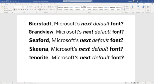
As pictured above, the new potential default fonts are called Tenorite, Bierstadt, Skeena, Seaford, and Grandview. All five are sans serifs—shots fired at the legacy of Times New Roman—and the Microsoft Design Team made a case for each when unveiling these new options.
Tenorite appealed because it took an opposite approach from Calibri (round, wide, and crisp rather than soft corners and narrow proportions). Bierstadt is Yet Another Helvetica Impostor™ (aka, a new typeface in the “grotesque sans serif” category). Skeena and Seaford are sans serifs each designed to mimic certain aspects of serifs. The former is based on the shape of serif typefaces; the latter is “rooted in the design of old-style serif text typefaces” to evoke familiarity. And Microsoft evidently means serious familiarity.
“To pinpoint the kind of familiarity and ‘comfort’ the typeface should evoke, we also looked at pictures of old armchairs: in chair terms, we were going for a practical interpretation of a beautiful family heirloom; durable upholstery, nothing overtly plushy or nostalgic,” wrote designer Nina Stössinger. “And when it comes to italics, it turns out there are parallels between chair ergonomics and typography: rather than inflating it and making it softer, trust the rigid moments that are good for your back.”
at-them on Twitter. No public vote or anything. Evidently, this is not a font-acracy; the ultimate decision will be made in Redmond.
Update, 6:15p ET: We heard back from Microsoft’s PR team shortly after publication to clarify any confusion from the blogpost. Segoe UI is Microsoft’s Windows and Web UI font while Calibri has been the default font for user’s content (such as with Microsoft 365 apps). Whatever new font is declared the winner, it will replace Calibri in that Microsoft 365 role specifically.
Listing image by Microsoft