In the map above, the National Oceanic and Atmospheric Administration shows July’s unrelenting worldwide heat. The darkest red—around Mexico and Central America, northern Canada and Alaska, and equatorial Africa—shows areas that logged record-high July temperatures. Lighter red indicates an area was much warmer than average, while the faint red indicates it was simply warmer than average. Less than 1 percent of the world’s surface had a record-cold July, according to NOAA.
2. Global July Temperatures Plotted Through 2023
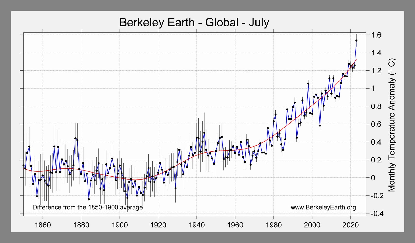
Courtesy of Berkeley Earth
Here’s another way of looking at July temperature anomalies, in this chart from Berkeley Earth. The global mean temperature in July was 1.54 degrees Celsius above the average between the years 1850 and 1900. (That time period is used as a benchmark for the preindustrial period.)
When the Paris Climate Agreement talks set a goal that humanity would try to hold temperatures to 1.5 degrees C above preindustrial levels, that meant sustained temperatures. That is, this July may have hit 1.54 above preindustrial temperatures, but overall the world has warmed 1.1 degrees C above them.
But as you can see in the Berkeley Earth graph, the July 2023 temperature (farthest right) leapt far above previous years. It beat the previous record, from July 2019, by 0.26 degrees C. So while the Paris Agreement target hasn’t been exceeded yet in terms of averages over many years, the Berkeley Earth report concludes, “isolated anomalies above 1.5 °C are a sign that the Earth is getting close to that limit.”
3. Heat Domes Over the US
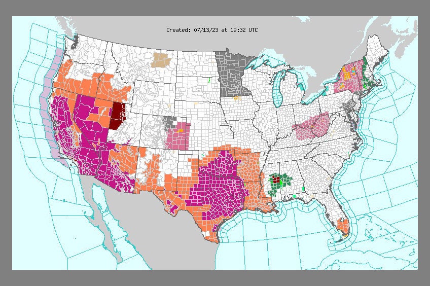
Courtesy of NWS
In July, a “heat dome” settled over the southern and western bits of the US. It’s a good example of how extreme heat can spike. In this map from the National Weather Service on July 13, we see areas with excessive heat warnings in purple, while orange signifies heat advisories.
A month later, another heat dome hit the central US, with Lawrence, Kansas, clocking a heat index—which considers both temperature and humidity—of 134 degrees F.
Heat domes are self-perpetuating monsters, thanks to their tendency to fuel themselves. A heat dome begins when air sinks from high altitudes, heating up significantly before it hits the ground. As the days go on, moisture evaporates from the landscape, raising temperatures still further. A heat dome also prevents clouds from forming, so the sun’s energy keeps hitting the ground full-force.
4. Absurd Land Surface Temps in Phoenix
Courtesy of NASA/JPL-Caltech
Throughout July, relentless heat baked Phoenix, with 31 days straight of temperatures exceeding 110 degrees. It smashed the previous record of 18 days. In the NASA animation above, the deep red indicates land surface temperatures up to 102 degrees. Notice how between July 2 and 19, Phoenix gets progressively hotter.
But if highs exceeded 110 degrees, why are these surface temperatures below that? Because these readings were taken between 2 and 3 in the morning. It’s a striking illustration of the urban heat island effect: Roads and buildings absorb heat during the day, and slowly release it at night. This sustained heat takes a huge toll on the human body whenever people can’t get the respite of cooling off at night.
5. Wildfire Devastates the Town of Lahaina, Maui
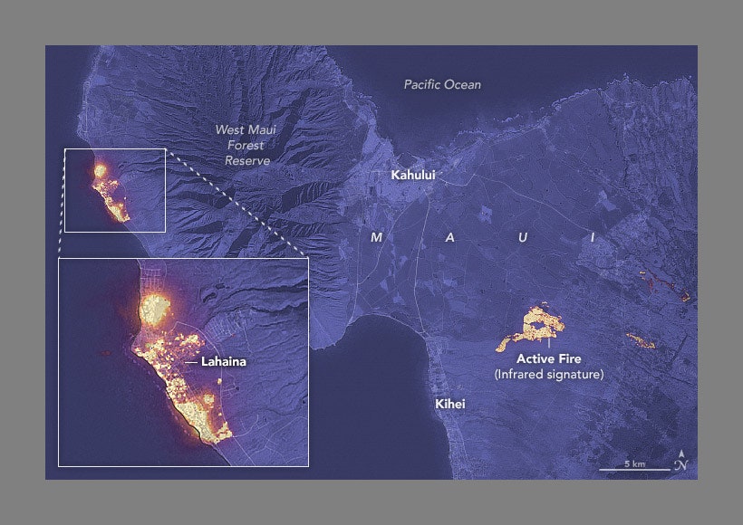
Courtesy of NASA
On August 8, the deadliest wildfire in modern US history tore through the coastal town of Lahaina, Maui, driven by 60-mile-an-hour winds pouring down a mountainside like an avalanche. The death toll has risen to 115, and crews are still searching the ashes. The map shows the yellow infrared signatures of active fires on August 8.